Thursday, December 13, 2012

Final Project: Final Result!

There has been lots of progress in the series of Fantasy Of Love's Progress. The Character's came along well, however I was unable to reach the full list that I had wanted to obtain by the deadline of class. I am missing one character, the leader of the evil, who is an important key in the story. A hero story is not complete without a villain - however we still have the cute yet evil kitty
A-Mi, to fulfill some villain duties. 


Above are the in progress coloring I had drawn for A-Mi and Yue.

I will now present to you the final product of the design class.


Even though I was unable to finish Chong Il to complete the cast, I feel happy in how far I've come.
Before this project, I was confused on basic formats such as location and the characters relations in my mind. I barely even know who these people were, however I took the time to think about that and came up with their personalities in a month's time.

Monday, December 3, 2012

Final Project - Near Complete

The Heros have begun coming to life with color!!!

I am thrilled to have all of the main hero cast done for the story! I think they are a great group!

Here the progress from last week!

Meet Blaze:

A Korean Baseball Organization (KBO) baseball player for the Haneul Hawks. The KBO is in charge of all major league teams in South Korea. This character is based off my mom's passion and love for baseball and the burning passion that fire can represent. Blaze's one goal in life is to be the best baseball player in the country, however his involvement with his fate of having the power of the element of fire makes this difficult.


Re meet Yue: 
She was redrawn!
Yue is a tomboy and she expresses this with her simple chic. She hates high heels and cosmetics and is nearly a polar opposite of her best friend, Naylei and Naylei's Boyfriend Jinho. She's very laid back and if often seen playing video games or reading a book Yue is based off of my best friend. She is also the only Asian of the group that is Chinese instead of Korean and is also the only one that speaks three language (Mandarin, English and Korean) instead of two.

Yue's power of having psychic abilities and time control is based upon her intelligence.


I have finished the villains' profiles and begun drawing the assistant, A-Mi.
I placed Yue in the drawing to show the scale of A-Mi versus a human.


Here is the profile of who A-Mi works for.


Tuesday, November 27, 2012

Final Project: 3rd Post

Greetings! This is the third blog post for my Design for Media Final Project. 
The image above is actually a combined group photo of the front views of the finished characters Jinho,  Naylei and Yue. After realizing that Jinho and Naylei are dating I figured I should make a relationship chart of the characters to figure out how does this person know that person and what do they mean to that person.

There is also a height difference in my characters. I wanted to place them together to show their height in relation to each other.
Jinho - 5'10
Naylei - 5'7 (without heels - however she usually has heels on)
Yue -5'4
Blaze - 6'1 (he has not been drawn yet)


This is the group photos before Yue was added to the group. 

Naylei's character chart was finished last week and I have combined the 4 positions of front, side, back and side for her character sheet. Naylei is based upon myself in physical and interests but her personality is different to accent her role as the leader. 

As a reminder here is her character sheet once more


Over the Thanksgiving holiday break, my main focus was to get a sectional plot done. This plot takes place in the middle of the story. The main purpose of these characters is to be in this setting in Sky City where my imagination looms. I plan to one day have all of the characters that are completed by this project in a novel that I hope to write for young adults. I would like to one day publish that novel in English speaking countries and South Korea, in the Korean language. 


As of now, I am behind on my chart. I made chart with new goal dates to encourage me to catch up to where I need to be to finish the project on time. 

My old Deadlines:
11/13 - Begin writing character profiles/do basic rough sketch
11/20 - Get 2 characters completely fleshed out and starting with color
11/27 - have all the main hero characters done
12/4 - complete villains/clean up work/look over details
12/14 - finished! present it all. 


Tuesday, November 20, 2012

Final Project: Simple W's of Creation

(Above: Busan, Korea - Wikipedia)

Where

My fictional story begins in a city that I have named 하늘시티/haneulsiti (which translates to Sky or Heavenly City). This is a fictional city I created that combines the best of Korea's two most populated cities, Busan and Seoul, and combines them into what I imagine to be 하늘시티.  

Busan is widely known for is vast landscapes, beaches that stretch across the city scape, seafood and is also becoming Korea's convention center capital. It is also home to the world's largest department store (NYC's Macys store is second largest).  I have taken the capital city aspect of Seoul into Sky City. Seoul is seen as the center of media, tourism and has a vast amount of different areas with their own styles (such as the rich area of Gangnam and Hongdae, popular among the indie crowd). 
These are the things from Busan and Seoul that I have adapted into Sky City.

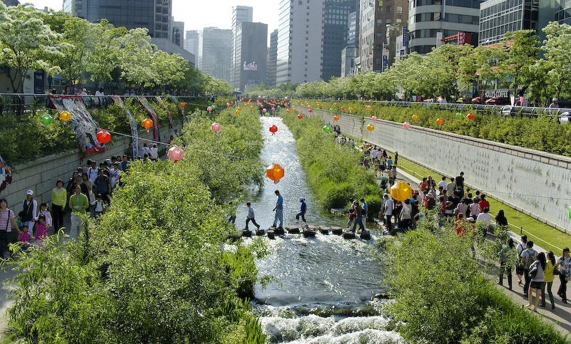
(Above: Cheonggyecheon, Seoul - Wikipedia) 

When

The setting is in the near future. Possibly between 2015 and 2020. If this story were to be published in a book or set as a story line for a drama in Korea then it would be placed during the year of publishing. 

Why

The creation for Sky City and my characters are based upon a love story in my mind. The plot is based around a fangirl's fantasy dream of being with her favorite pop star, however its the pop star that chooses her after seeing her beauty. Their meeting has a special meaning, as it was planned by a historic event that repeats every few centuries. The boy and girl are really super humans with incredible powers beyond their belief. The main male, who has been an angel his entire life feels comfortable reveling his hidden angel wings to his crush - which starts the cycle of history to repeat. One of the members of the boyband becomes jealous and becomes an evil villain, in which the couple and friends that they meet along their path will have to defend the citizens from with their powers.

Who

As if now I have completed 3 side views of my main male character Jinho. 


And two character profiles for the main females


I will have my chart posted with the next update.


Tuesday, November 13, 2012

Final Project Idea: Character Designs

Greetings!

My last project for Design 4 Media this semester is a Student Choice Project. 

I have decided to resume an idea that has been years in the making. Completing characters that are in my Fantasy of Love series means a great deal to me, as they have been a part of my life for several years. However, I have not been able to flesh out completely. 

My final presentation will include character designs of the four main heroines/heros and two villains 
Plans may change for the amount of characters I do, however that is the original amount that I have.


My love for the Korean Pop Music culture or K-Pop is involved in my style of art, the characters and their personalities. The above are my sketches intended for the comic design of the first and main story. I decided to have my main male character and a few other characters to be based upon the idea of the Korean 'Flower Boy' or 'hwarang' is a boy who is very feminine in his looks. It is quite attractive to several women in and outside of Korea. Nu'est's Ren is my main muse. 

Example of what I wish to achieve:


My Deadlines:
11/13 - Begin writing character profiles/do basic rough sketch
11/20 - Get 2 characters compeltely fleshed out and starting with color
11/27 - have all the main hero characters done
12/4 - complete villains/clean up work/look over details
12/14 - finished! present it all. 

Tuesday, October 30, 2012

Pipeline Project - Credit Editing Part 2

Editing the credits for The Lost Files will be completed during today (Tuesday)'s work session in class.
There was a lot of progress made on Thursday, however there are a few things that are needed to be completed before we move on to other things in the documentary and animation departments.

Last week, I went through files of photos provided by the photographers to see which ones would be decent shots to add into the credits. Christine went thru the photos with me and we selected from the images that I chose to be in the final cut. Arranging the letters became difficult, so we wouldn't be blocking the text with a photo that faded in.

The original plan for the credits was to have them be 30 seconds long. As a test, we added less time to see the results. At 19 seconds, the credits and images roll too fast to be comfortable for our eyes. This will be edited longer time frame once more. Everyone's roles must be edited as well to be more specific for that the person has actually done.

There is one section that needs to be filled out - music credit. It was just announced to me yesterday that  The Lost Files received permission from the person who created the music that was being used as the base around The Lost Files. Their name and the song title will be placed in the spot we saved in the credits.

(The Lion King, Disney)

I was watching different credits to get a base of how ours felt among ones used for industry produced movies and t.v shows. I noticed that Disney places their logo at the end of the credits. The signature castle with the shooting star and "Walt Disney Pictures" shows as a reminder that it is a production by Disney. I asked the Emma and the head of my department what they thought about the idea and they liked it. This is why we have added the logo for The Lost Files at the end of the credits sequence.

(Kim Possible, Disney)


Tuesday, October 23, 2012

Pipeline Project: Credit Editing


The chart above is the current schedule for the crew members of The Lost Files. As the animation crew finishes the scenes of the animation, I am working on the credits section of the video with Christine. We have decided together to work in Adobe After Effects with the text and files we are using to composite that section documentation of everyone's positions in the credits.

One of the first decisions we came across was the format of the names being displayed across the screen. There are several types of ways that movie credits roll across, however we chose a simple method of title on top and person/persons involved with that role underneath. We chose this style because of the number of crew members we have and our jobs. Usually, it seemed as if actors and actresses had split section credits, where the character name would be on the left and the person's off stage name on the right. There are no action parts in The Lost Files, so we began to use the more credits simple style.


As displayed in the first draft above, we have added some animations in with the credits to make reading them more enjoyable and to display some draft work created by the crew.


The current draft has several changes including more animation work being displayed, color change of the different animations, and a color palette. As the list moves down, the list of jobs changes departments. We discussed having animations around the animators section, photo documentation around the photo section towards the end of the credits.


During class I took some notes on what needed to be completed and how things should be completed for the credits. We aim to have the credits completed by the end of class on Thursday. Some of the numbers for the photos represent a specific file name of an image that the documentary team has taken of the crew working. 

Thursday, October 18, 2012

Animation Reaction to Sound

Greetings! For my animation class we were given sound clips from different places to choose from. I chose an audio from Anchor Man. We were told to try and not discover what the actual clip looked like until after we finished our animation so we keep a fresh idea.

Here is my final result:
The original clip:


In my personal view, I believe that what I had imagined was better than the original clip. There is a lot of emotions in the yelling voice, and barely any emotion in the secondary voice. The actions of the actors don't seem to portray what is needed to be shown. It could be because I have never seen the actual movie as a whole, but the scene should be understandable by itself with matching body language and emotions. I don't feel that.

For my animation, it took about a week to complete. We were told to only do a rough, however my personal style is a bit more of a finished look, even as a rough. I do realize that the mouth motions of my character sometimes fit the words and sometimes do not. I will work on that for my future characters and have been recommended examples and help from my teacher about what to do to time sounds and mouth emotions.

Tuesday, October 16, 2012

Pipeline Project: Sketches and Position

The Lost Files seems to be in some good progress. The characters and storyboard seem to be in full fledge. We figured out that the main character would be a girl with a ponytail, sweatshirt and pants. We will give her a generalized look for roughed out animations before the final stylizations are applied to her.


The above is my depiction of Emma's style for her character. My style is more realistic than cartoony, so it has been difficult to adjust. This was a lesson on my part to try and develop a flexible hand at being good in more than just one kind of style. During class, we created small animations that could be helpful to the project. 


Unfortunately, because of our time, me assisting on the animation after the storyboarding section of the project might not be the best choice. After talking with the leaders, I will see if my position in being on the color team would work well. 


The above image is a finished portrait of Choi Minki (Ren) of Nu'est. He is a person I use a lot as a male character in my Fantasy of Love theme. I am displaying this to show what my usual style looks like and how I depict color. Obviously, bright and fun colors would not go well for the Lost Files, but this is just an example of how I select my colors for certain characters. Our girl in The Lost Files would have a darker palette.

Edit:
I am working on the credits list with Christine at the moment and will be working with coloring when the animation needs coloring.

Tuesday, October 9, 2012

Pipeline Project: Preplanning

Today's agenda with the lost files displays that we are going over all our basic details to begin week one of the project. I am working with the storyboarding team, however will expand my areas after the storyboarding section is complete. It will be one of the fastest sections of the entire thing.


During class, we began to develop the storyline and some boards to put into our main storyboard and the anamatic. First, the plot was created from the beginning segments that the crew had developed. The above picture displays my beginning design. We are keeping the designs for the board very simple as to not clash with the development of the Character Development department. 

Tuesday, October 2, 2012

Pipeline Project - Flash Mob Reaction idea.

Flash Mob Reaction Video

This project would be a video done in public to show the reactions of people to a dance being preformed in a random setting. Using the ever so popular K-Pop song “Gangnam Style”, a group of dancers would learn the song to preform flash mob style at different spots around Columbus. 

(credit: YG Entertainment)

The point of the dance would be to show the reactions that different people have in different settings, times and reactions between different age groups. Being that “Gangnam Style” is a Korean song, the fact of a non-English song could also receive specific reactions that an American song would not get.

There will be the three required positions (director, head of art direction and head of editorial) as well as other positions such as Choreographer , Reaction Videographers, Dance Videographers, Stylists, Audio Keepers, Dance Crew and Travel Correspondents. 

And for the timeline...
Click to see it closer. I apologize for its a small file size.


Monday, September 24, 2012

Animation: Morph Cycle


Greetings!

I have a basic animation cycle from class to morph three objects into each other. It may seem simple but it takes some time to figure out how your items will become each other. 

A huge part of my life at the moment is my involvement in the Beauty Pageant world. I am a current title holder for a state pageant, and an optional contest winner at nationals. I wanted to incorporate my personality into my assignment so it wouldn't be 'just another piece of homework' to me. 

(Image credit to The Korea Times)

The girls above are from the Miss Korea 2012 pageant. They are wearing the standard crown, sash and evening gown that pageant winners are typically wearing at the time of crowning.

Tuesday, September 18, 2012

Project Hiroshi Hayakawa (Part Three)

For my project I became interested in using my idea for my final illustration. 
I seem to be going with a flow rather than a set patter of how I want things.  


I didn't really change much to what was going on the the previous image, however i did play with some  concepts. Lines vs no lines. -I like lines, being that I love cartoons, however the lines create a certain effect. More boldness, sharpness and combined with a shadow create 3D effects. No line is flat but gives more of the direction im looking for.

Tuesday, September 11, 2012

Project Hiroshi Hayakawa (Part Two)

Neutral colors! 


This is my color palette for the Figure As Landscape project that I will complete. I chose these tones because they most represent colors that nature provides naturally. With most of my composition being underground, brown tints, tones and shades play a major role. I am leaving myself with three browns to work with at the moment, however that might change as I continue the project.

There are some pink colors in my palette. They are for the flowers on the vines that will grow on the body. There is also a yellow/brown color for the body's flesh. it looks like normal tan skin above ground yet is light enough to be seen as roots underground.


This is a test sample of how I want to display the final image.
The little object in the bottom corner is a worm. They live underground!

The final image would include dirt details, rocks, detailing in the carved wall, shading, depressing clouds (maybe) and a few other things!